  1
  2
  3
  4
  5
  6
  7
  8
  9
 10
 11
 12
 13
 14
 15
 16
 17
 18
 19
 20
 21
 22
 23
 24
 25
 26
 27
 28
 29
 30
 31
 32
 33
 34
 35
 36
 37
 38
 39
 40
 41
 42
 43
 44
 45
 46
 47
 48
 49
 50
 51
 52
 53
 54
 55
 56
 57
 58
 59
 60
 61
 62
 63
 64
 65
 66
 67
 68
 69
 70
 71
 72
 73
 74
 75
 76
 77
 78
 79
 80
 81
 82
 83
 84
 85
 86
 87
 88
 89
 90
 91
 92
 93
 94
 95
 96
 97
 98
 99
100
101
102
103
104
105
106
107
108
109
110
111
112
113
114
115
116
117
118
119
120
121
122
123
124
125
126
127
128
129
130
131
132
133
134
135
136
137
138
139
140
141
142
143
144
145
146
147
148
149
150
151
152
153
154
155
156
157
158
159
160
161
162
163
164
165
166
167
168
169
170
171
172
173
174
175
176
177
178
179
180
181
182
183
184
185
186
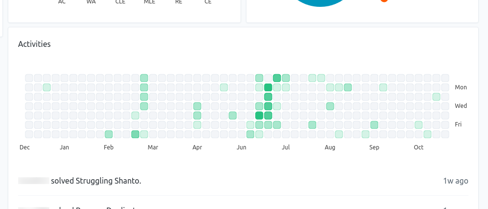
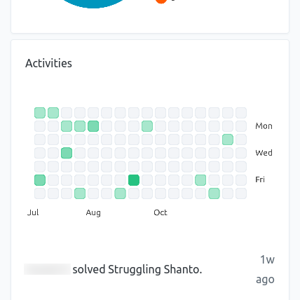
| import { Chart } from 'chart.js'
import { MatrixController, MatrixElement } from 'chartjs-chart-matrix'
// Register the matrix chart extension with Chart.js.
Chart.register(MatrixController, MatrixElement)
// Define shades of green for the activity chart cells.
const greens = ['#d4f3e6', '#a8e7cd', '#7ddab3', '#51ce9a', '#26c281']
// The function chartData returns the `data` object for Chart.js. It takes the
// activity count for each day in the largest window (1 year) as a map. The
// key is the day number since the epoch. The value is the number of
// activities in that day. The function also takes a parameter that indicates
// the number of columns the chart will show.
const chartData = (counts, cellXCount) => {
// Determine the smallest key in the counts map.
let kmin = Infinity
for (const k of Object.keys(counts)) {
const ki = parseInt(k)
if (ki < kmin) kmin = ki
}
// Prepare the data array for the only dataset. The x value for the data
// point is the week number. The first week on the chart is indicated with
// a 0. The y value for the data point is the day number of the week.
const data = []
for (const k of Object.keys(counts)) {
const ki = parseInt(k)
const date = new Date(k*24*60*60*1000)
const x = Math.floor((ki-kmin)/7)+1
if (x <= 52-cellXCount) continue
data.push({
x: x-(52-cellXCount),
y: (ki-kmin)%7+1,
count: counts[k],
day: k,
date: date // Include the date object for use in the tooltip and tick generation.
})
}
// Determine the maximum activity count for any day on the chart. This will
// be used to choose the shade of green for each cell on the chart.
let cmax = 0
for (const v of data) {
if (v.count > cmax) cmax = v.count
}
// Set the colors for the cells. The cells representing the maximum activity
// will be assigned the darkest shade of green. The cell with the least
// non-zero activity will be assigned the lightest shade of green. The cell
// representing zero activity will be transparent.
const backgroundColor = []
const borderColor = []
const now = new Date()
for (const v of data) {
if (v.date < now) {
if (cmax == 0 || counts[v.day] == 0) backgroundColor.push('#e7ecf180')
else backgroundColor.push(greens[Math.round(counts[v.day] / cmax * (greens.length-1))])
if (cmax == 0 || counts[v.day] == 0) borderColor.push('#e7ecf1')
else borderColor.push(greens[Math.min(Math.round(counts[v.day] / cmax * (greens.length-1)) + 1, greens.length-1)])
} else {
backgroundColor.push('transparent')
borderColor.push('transparent')
}
}
return {
datasets: [{
data,
borderWidth: 1,
borderColor,
backgroundColor,
borderRadius: 4,
width: 16,
height: 16
}]
}
}
export default (el, counts) => {
let data = chartData(counts, 52)
const chart = new Chart(el.getContext('2d'), {
type: 'matrix',
data: data,
options: {
scales: {
x: {
display: true,
min: 0.5,
max: 52.5,
offset: false,
grid: {
display: false,
borderColor: 'transparent'
},
ticks: {
// Use the ticks callback property to customize the x-axis tick
// labels. In this case, we are using the month name as the tick
// label.
callback(value, index, ticks) {
const v = data.datasets[0].data[Math.floor(value)*7]
if (v) return v.date.toLocaleString('default', {month: 'short'})
return ''
}
}
},
y: {
display: true,
position: 'right',
min: 0.5,
max: 7.5,
grid: {
display: false,
borderColor: 'transparent'
},
ticks: {
// Show Mon, Wed, and Fri as the y-axis tick labels.
callback(value, index, ticks) {
switch (value) {
case 2:
return 'Mon'
case 4:
return 'Wed'
case 6:
return 'Fri'
}
return ''
}
}
}
},
// Disable the built-in responsive behaviour of Chart.js.
responsive: false,
maintainAspectRatio: false,
tooltipFillColor: 'rgba(0, 0, 0, 0.5)',
animations: {
numbers: false // Disable animations used by the matrix chart extension.
},
plugins: {
legend: {
display: false
},
tooltip: {
enabled: true,
callbacks: {
title() {
return ''
},
// We added the date to the data point. We can use it to generate the tooltip.
label(context) {
return `${context.raw.count} solution(s) on ${context.raw.date.toISOString()}`
}
}
}
}
}
})
function render() {
// Trigger a chart resize to ensure that the chart's internal width field
// is up to date.
chart.resize()
// Calculate the number of columns to show based on the available width of
// the chart.
const area = chart.chartArea || {}
const cellWidth = 16
const cellXCount = Math.floor(area.width / (cellWidth+2))
// Recalculate chart data using the new cellXCount value. Ensure that we
// never attempt to show more than 52 weeks' worth of data.
data = chartData(counts, Math.min(cellXCount, 52))
chart.data = data
chart.options.scales.x.max = Math.min(cellXCount, 52)+0.5
chart.update()
}
// Re-render the chart on screen resize.
window.addEventListener('resize', () => render())
// Render the chart right now for the first time.
render()
return chart
}
|