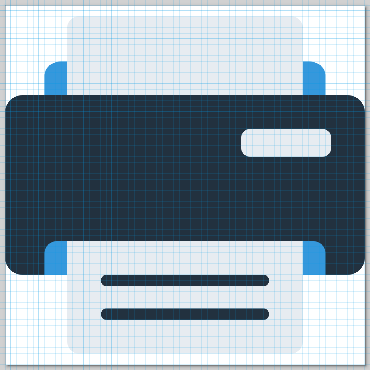
Editing an SVG Icon to Be Resize-friendly
This blog post is about something that I think I have absolutely no expertise in: graphics. But that also makes exploring this field and the aha moments much more rewarding.
A few weeks ago, I was working on adding an icon to the Toph Printd executable. I started to look for a suitable vector image on a paid vector icon and sticker repository I subscribe to.
I found one that I liked.

It needed some colour changes to match the branding of Toph. But that was very easy. I opened the SVG in Inkscape and made changes to the colour. I was going for a more flat look, so I removed some extra elements.

But here is the thing.
The icon appeared blurry when I exported them as raster image files in different dimensions.
Notice the first few images in the set.
The two bars on the printed page appear blurry. Not only when you zoom in but also when displayed in their sizes.
Even on the 128×128 image, notice how the edges of the various parts of the printer look blurry.
I realized that the original image do not have its elements aligned to pixels. And since the icon is drawn on a 512×512 canvas, exporting it to smaller images worsens the issue.
The solution: To work around this, I edited the icon in Inkscape to give each element x, y, width and height values multiple of 8.

After making the changes, exporting the icon to raster image files appeared crisper:
This post is 91st of my #100DaysToOffload challenge. Want to get involved? Find out more at 100daystooffload.com.
comments powered by Disqus


